
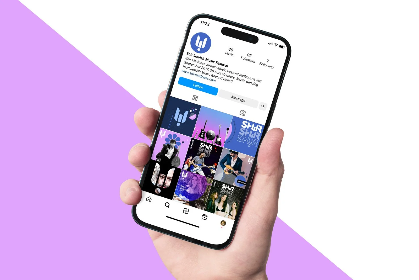


This project was to rebrand a Jewish music festival, called Shir Madness and make it appeal to a broader, more youthful audience. The client wanted to shed their outdated look and define themselves as modern and edgy.
It was important that the logo not be overtly Jewish, while still maintaining a nod to the culture. This is achieved by creating a Shin (Hebrew letter which is the first letter of the word Shir, meaning song), within the forms of the H, I and R.